I was surfing the internet yesterday afternoon, trying desperately think of something good to post on (to say I've had blogger's block the past few weeks would be a serious understatement). I was just about to give up when I spied this fun and fabulous guest room on one of my favorite interior designer's websites (go HERE for all sorts of colorful, West Coast design courtesy of Jeffers Design Group). What's even better is that Jay Jeffers decorated not one, but two, guest rooms in this house in distinct, yet parallel, styles. I think the lesson to be learned from this is a great one: By repeating certain elements and using a similar layout in each space, Jeffers manages to create a continuity of style without repeating the color palette. This is an excellent option for those who (like me) want to unify the style of their home while still experimenting with different colors and patterns.
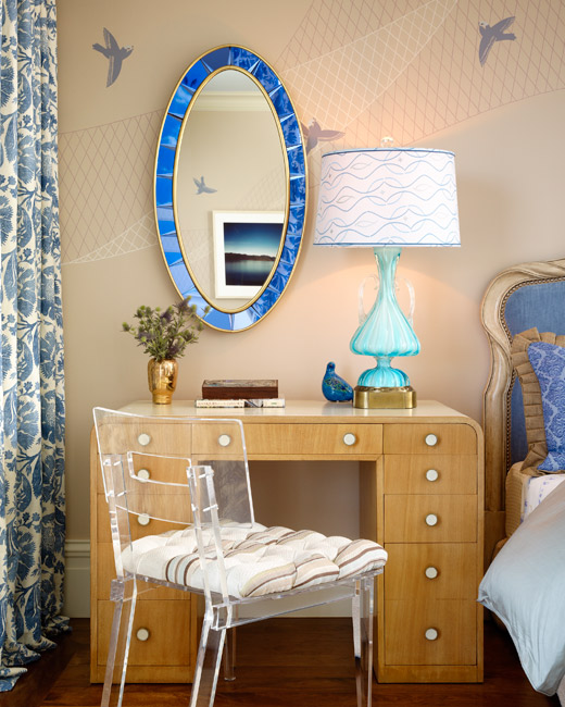
The mixing and not quite matching going on here in this guest room is utterly brilliant. Note how two different side tables are unified by a matching pair of glorious turquoise table lamps. The mix of linens on the bed gives a more casual feeling to the space, while the unifying hues of blues and sand keeps the bed from feeling completely haphazard. One might describe this as controlled eclectic.
Another interesting element to the mix is that Jeffers didn't try and match all of the blue tones in the room. There are elements of turquoise, royal blue, baby blue, cobalt blue and slate blue throughout the room with a net result far more sophisticated and relaxed than a single shade of blue would have ever been.
I love how Jeffers included a subtle pattern on the lamp shades as well; it just goes to show you that when decorating your own room you can really get a big pay off by thinking beyond white or ivory shades! And do I even have to say how divine that mirror is?
Similarly, the bold mix of patterns, from the large scale floral of the drapes to the small houndstooth on the accent chair create an interesting mix that is unexpectedly elegant. The antique milk glass on the mirrored dresser and the silver and glass water pitcher and glass are small, vintage touches (like the turquoise lamps) that give some weight to the modern, lighthearted furniture.

In this second guest room, there are a large number of elements that echo the first room. The walls of the room are similarly bedecked in a fun, graphic (but not overly busy) wallpaper. The ceiling is painted in a lively hue (here pink, in the first room, blue) and trimmed in crown molding. The lighting elements are also similar with the drum pendant ceiling light and oversized table lamps. One side table doubles as a desk, which is paired with a lucite chair to keep the room from feeling overly crowded. On the opposite wall, a small accent chair and side table could be enjoyed as a reading nook or simply additional seating when guests are visiting. Small area rugs surround the bed, a cost effective option in lieu of an oversized area rug.

What don't I love about this vignette? I love this wallpaper: it's colorful and fun without being overly busy (thanks to an abundance of white space). I think this more minimal pattern is more successful in a larger space than a very tight, very busy pattern, which, although wonderful in a powder room or on a single wall, can completely overwhelm a larger room. The fabric on the petite settee is also darling, and it works with the wallpaper because it's much smaller in scale but still in the same pink and green on cream palette. The pale blush color and lovely detailing on the dresser are also divine (I want!). Even the small white deer manages to be cute without veering into overly precious. When paired with the pink milk glass vase and green glass balls on the side table, the pieces come off as much beloved objects inherited from family or maybe just picked up on the cheap at the local thrift store.
Inspired by these two cheerful rooms, I thought it would be fun to design a mood board for a third guest room, bearing in mind the style and elements of the first two. This time though, I'm employing a soft yellow and gray color palette, a lovely pairing that not only compliments the bright, happy pastels of the first two rooms, but is also incredibly en vogue.
I'd start by papering the walls in Hygge & West's daydream wallpaper in yellow (pictured above), which is very reminiscent to the wallpaper Jeffers used in the blue guest room. I would then paint out the ceiling in a medium tone gray, like Farrow & Ball's Pavilion Gray or Benjamin Moore's Coventry Gray.

For lighting, this four-tiered pendant fixture from Lights Up! has a lovely modern pattern that coordinates perfectly with our gray and yellow theme. Wall-to-wall drapes in a nice yellow and white stripe (love the grommets!) are a nice geometric contrast to the graphic gray and yellow floral bedding from BlissLiving Home and the sweet wallpaper. To up the sophistication factor, I'd use Jonathan Adler's woodhouse bed in a wonderful platinum velvet and pair the bed with mismatched mirror side tables from Horchow that convey a traditional, antique-y quality that will contrast well with the more modern elements in the space. Note how one of the tables sports a subtle stripe, which will tie in well with the striped drapes and throw pillows (remember, repeating a pattern on several elements in a room will help keep the overall look cohesive!). To squeeze in a place to pay bills or blog away on a laptop, I'd tuck in this gorgeous lucite bamboo chair underneath the second art deco side table. For smaller accessories, buttery yellow gourd lamps from Shades of Light will provide necessary task lighting as well as bring in another yellow element into the room. A few smaller geometric rugs in a cool platinum gray and white from Dash and Albert are cozy and bring another larger scale pattern into the room. This gorgeous Venetian ribbon mirror had me at "hello" and would look fantastic over the small side table doubling as a desk. And finally, for small accessories, I'd pick up a few inexpensive milk glass pieces (I particularly love hobnail pieces), tons of which can be found on Etsy. They'll add a nice vintage touch (and some additional texture) to the room while still keeping it light and bright.


















10 comments:
I like your mood board the best of all. I am not usually a fan of gray rooms, but yours has real freshness and personality. Well done as always. Have a lovely weekend.
Fun mood board! You know I love that lucite bamboo chair too. I am still swooning over the images above. Wow, the houndstooth chair is fabulous. You are right too with the color scheme - mix shades of the same hue for interest.
Have a great weekend!
cristin @ simplified bee
Love those rooms! They look very coastal and fresh, and your mood board totally captures that vibe as well. (P.S. I'm going to win the lottery and buy that headboard!)
Of course, I am loving the gray and yellow (I'm only sad that as soon as I make my dining room yellow and gray, the style will be out.out.out). I adore the second room. Definitely lots going on and it packs a punch but I adore it!!
thanks for the great comments on my blog today! Awww, it was so much fun. And I loved my sister's dress too... She was excited because she felt less "mommy" for a change.
i like the board too! a person could go crazy trying to match blues - especially on a printed page!
I think you should employ all of your ideas in one of your very own guest rooms then show us the after photos! :-) But seriously, great ideas. All of them.
Now I'd like to move into that pink Jeffers room. Pronto!
you have so much style and creativity, Averill! Great post!
Great choices Averill! I just love that first room - it's really different. It's nice to see a fresh approach to blue and white. That mirror is so interesting. And a denim headboard!
I would happily be a guest in your room any day! I love how gray really relaxes the bright yellow. I'm also a huge fan of the duvet in the first photo.
love your gray mood board!! very beautiful!
- {darlene}
fieldstonehilldesign.com
Post a Comment