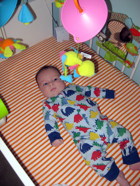
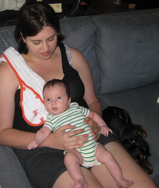
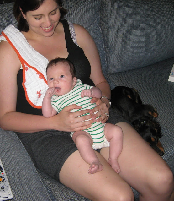
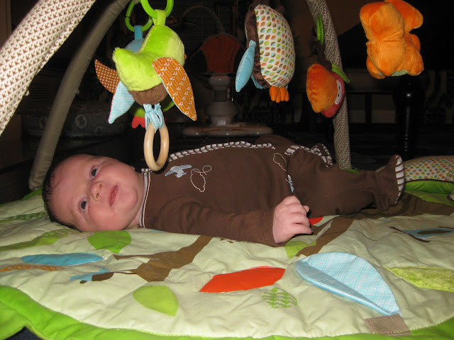
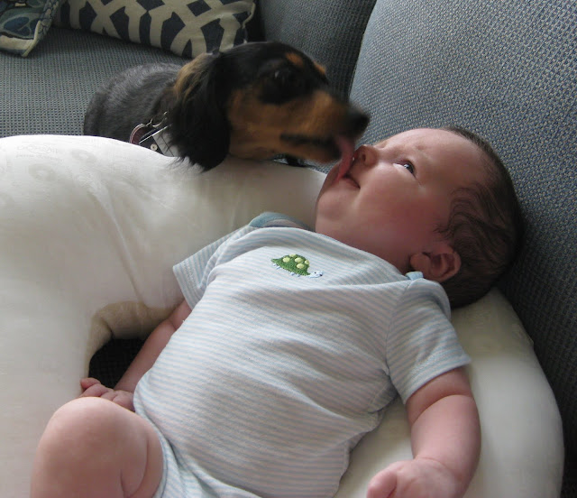
Monday, November 9, 2009

Mood Board Monday

Antwerp Chair, spectrum swirl (Anthropologie; $1698)

Today brings a second installment of Mood Board Monday (this time hosted by the lovely Tracy of Comfort & Luxury). This week's challenge is to design a room around one of two Anthropologie chairs (I chose the Antwerp chair pictured above for its colorful paisley pattern and lovely traditional shape). I decided that, while a chair like this certainly deserves to be the star of the show, it also needs pieces that can stand up to it a bit -- items and fixtures that could balance all of this fabulousness with a bit of...gravitas, shall we say?

When I think about rooms with some weight (both literally and figuratively), I think of a masculine study or library, complete with dark walls, old leather and brass fixtures -- the kind of room that wouldn't be out of place in Sterling Memorial Library or an equally venerable, equally stodgy institution. So what would happen if that sort of room were introduced to a chair such as this? Suddenly, a masculine study would take on a more modern, more colorful personality. A little bit traditional, a little bit eclectic bohemian...and a little bit subversive.

Something along the lines of this:

Miles Redd

But with a dash of the New York Public Library thrown in for good measure.

With this inspiration as a touchstone, I've thrown together the following mood board:

Source list: 1. Paint Color: Slate Teal from Benjamin Moore. 2. Antique Maps from V&J Duncan (Eastern Hemisphere, ca. 1835 ($85) and England & Scotland, c. 1732 ($375)). 3. Adjustable Floor Lamp from Circa Lighting ($315). 4. NY Public Library table lamp from Circa Lighting ($420). 5. Portuguese Desk from Restoration Hardware ($1495). 6. Paisley Pillows from Anthropologie ($98-$115). 7. Conrad Sofa from Jayson Home & Garden ($5,495). 8. Paisley Rug in Ivory from Madelaine Weinrib.

Be sure to check out all the other wonderful mood boards inspired by this fabulous chair HERE.


Read more...

Friday, November 6, 2009

Guest Rooms in Blue, Pink...and Yellow!


I was surfing the internet yesterday afternoon, trying desperately think of something good to post on (to say I've had blogger's block the past few weeks would be a serious understatement). I was just about to give up when I spied this fun and fabulous guest room on one of my favorite interior designer's websites (go HERE for all sorts of colorful, West Coast design courtesy of Jeffers Design Group). What's even better is that Jay Jeffers decorated not one, but two, guest rooms in this house in distinct, yet parallel, styles. I think the lesson to be learned from this is a great one: By repeating certain elements and using a similar layout in each space, Jeffers manages to create a continuity of style without repeating the color palette. This is an excellent option for those who (like me) want to unify the style of their home while still experimenting with different colors and patterns.

The mixing and not quite matching going on here in this guest room is utterly brilliant. Note how two different side tables are unified by a matching pair of glorious turquoise table lamps. The mix of linens on the bed gives a more casual feeling to the space, while the unifying hues of blues and sand keeps the bed from feeling completely haphazard. One might describe this as controlled eclectic.

Another interesting element to the mix is that Jeffers didn't try and match all of the blue tones in the room. There are elements of turquoise, royal blue, baby blue, cobalt blue and slate blue throughout the room with a net result far more sophisticated and relaxed than a single shade of blue would have ever been.

I love how Jeffers included a subtle pattern on the lamp shades as well; it just goes to show you that when decorating your own room you can really get a big pay off by thinking beyond white or ivory shades! And do I even have to say how divine that mirror is?

Similarly, the bold mix of patterns, from the large scale floral of the drapes to the small houndstooth on the accent chair create an interesting mix that is unexpectedly elegant. The antique milk glass on the mirrored dresser and the silver and glass water pitcher and glass are small, vintage touches (like the turquoise lamps) that give some weight to the modern, lighthearted furniture.

In this second guest room, there are a large number of elements that echo the first room. The walls of the room are similarly bedecked in a fun, graphic (but not overly busy) wallpaper. The ceiling is painted in a lively hue (here pink, in the first room, blue) and trimmed in crown molding. The lighting elements are also similar with the drum pendant ceiling light and oversized table lamps. One side table doubles as a desk, which is paired with a lucite chair to keep the room from feeling overly crowded. On the opposite wall, a small accent chair and side table could be enjoyed as a reading nook or simply additional seating when guests are visiting. Small area rugs surround the bed, a cost effective option in lieu of an oversized area rug.

What don't I love about this vignette? I love this wallpaper: it's colorful and fun without being overly busy (thanks to an abundance of white space). I think this more minimal pattern is more successful in a larger space than a very tight, very busy pattern, which, although wonderful in a powder room or on a single wall, can completely overwhelm a larger room. The fabric on the petite settee is also darling, and it works with the wallpaper because it's much smaller in scale but still in the same pink and green on cream palette. The pale blush color and lovely detailing on the dresser are also divine (I want!). Even the small white deer manages to be cute without veering into overly precious. When paired with the pink milk glass vase and green glass balls on the side table, the pieces come off as much beloved objects inherited from family or maybe just picked up on the cheap at the local thrift store.

Inspired by these two cheerful rooms, I thought it would be fun to design a mood board for a third guest room, bearing in mind the style and elements of the first two. This time though, I'm employing a soft yellow and gray color palette, a lovely pairing that not only compliments the bright, happy pastels of the first two rooms, but is also incredibly en vogue.


I'd start by papering the walls in Hygge & West's daydream wallpaper in yellow (pictured above), which is very reminiscent to the wallpaper Jeffers used in the blue guest room. I would then paint out the ceiling in a medium tone gray, like Farrow & Ball's Pavilion Gray or Benjamin Moore's Coventry Gray.


For lighting, this four-tiered pendant fixture from Lights Up! has a lovely modern pattern that coordinates perfectly with our gray and yellow theme. Wall-to-wall drapes in a nice yellow and white stripe (love the grommets!) are a nice geometric contrast to the graphic gray and yellow floral bedding from BlissLiving Home and the sweet wallpaper. To up the sophistication factor, I'd use Jonathan Adler's woodhouse bed in a wonderful platinum velvet and pair the bed with mismatched mirror side tables from Horchow that convey a traditional, antique-y quality that will contrast well with the more modern elements in the space. Note how one of the tables sports a subtle stripe, which will tie in well with the striped drapes and throw pillows (remember, repeating a pattern on several elements in a room will help keep the overall look cohesive!). To squeeze in a place to pay bills or blog away on a laptop, I'd tuck in this gorgeous lucite bamboo chair underneath the second art deco side table.

For smaller accessories, buttery yellow gourd lamps from Shades of Light will provide necessary task lighting as well as bring in another yellow element into the room. A few smaller geometric rugs in a cool platinum gray and white from Dash and Albert are cozy and bring another larger scale pattern into the room. This gorgeous Venetian ribbon mirror had me at "hello" and would look fantastic over the small side table doubling as a desk. And finally, for small accessories, I'd pick up a few inexpensive milk glass pieces (I particularly love hobnail pieces), tons of which can be found on Etsy. They'll add a nice vintage touch (and some additional texture) to the room while still keeping it light and bright.


Read more...

Wednesday, November 4, 2009

Colorful Backdrops, Part 2

The response to my post last month on bookshelves, curios and built-ins with painted interiors was pretty overwhelming. It seems that there are many, many people out there who are as obsessed with the look as I am. So much so, in fact, that I thought I'd pull together a second set of images celebrating even more colorful backdrops.

Above, the bright orange shelves bring a jolt of fun color into an otherwise all white and gray space. It's also a wonderful contrast to the simple, white vases and the white magazine racks. An orange task light brings in a second pop of the same color and the repetition of the hue outside the shelving helps bring balance the composition.

Steven Gambrel

This pale blue gray makes my heart sing, especially against the soft off-white trim and dark ebony floors. It's the perfect, subtle statement and beautifully highlights all of the ivory and ecru pottery.

Tom Stringer

A subtle greige background to these built-ins adds dimension to the walls and helps highlight the owner's large collection of white porcelain. Note too how well balanced the arrangements are within the shelves themselves.

Martha Stewart Living

I love how nicely this coral interior sets off the sun bleached coral. You can bet this subtle play on words was intentional.

One of my all-time favorite dens. I love the oversized striped ottoman, mosaic tile around the fireplace, neatly tailored chairs in a variety of fabrics (love the squiggly pattern on the chair nearest the fireplace in particular). All in all, it's lovely. What's interesting too is that on first glance, blue appears to be the dominant color; however, when you look closer you realize that the only blue element in the entire space is the backs of the built-ins around the fireplace -- the rest of the space is entirely decorated in neutrals. The beauty of this is that a simple change of paint color in the built-ins would switch up the look of the room completely, without the need for changing any of the furnishings or other accessories.

Of course you needn't limit yourself to paint when it comes to kitting out your shelving. Wallpaper works just as wonderfully and, since you aren't covering a large surface area, can be just as economical. It's also a wonderful way to experiment with wallpaper without the commitment of having it on your walls. Here, the lovely tone-on-tone navy damask brings in another pattern into this sitting room without overwhelming the space and disturbing it's minimal, clean aesthetic. The traditional, ornate damask is also a nice, quiet contrast to the greek key patterned rug.

More blue here in this living room from Steven Gambrel. I love how the bright blue ties in with throw pillows and side chair and it's a wonderful contrast to the grassy green walls and crisp white trim work.


This room is actually from the Serena & Lily catalogue, but it's still one of the best designed bedrooms I've seen in a while. Of course, the fun pink walls behind the built-ins and all the Jonathan Adler pottery are right up my alley.

This is a great example of how you can use this technique to bring in a color used elsewhere in a room or in your home (the soft lime green inside this small bookshelf brings the pale green accent color used throughout this beach house into a spare bedroom). By using the same colors (in different proportions!) throughout your house, you can easily create a cohesive, well designed look. I also love how quiet and almost neutral the color looks against the warm neutral tones and rich texture of the grass cloth wallpaper.

I love a dramatic navy blue interior. Such a wonderful backdrop for all-white porcelain serveware. The Oly chandelier is pretty fantastic as well, isn't it?

Elizabeth Mayhew

A lovely, soft yellow is a subtle hit of color for these shelves. I particularly like how Elizabeth Mayhew arranged all of her many books and small objects. The effect is full and lived-in without feeling messy or too crowded. It's also nice to see bookshelves stacked full of, well, books. Far too many designers insist on keeping shelves woefully bare and devoid of books in my opinion.

And what about you? Have you experimented with color on any of your bookshelves, curios or built-ins? If so, I'd love to take a look at what you've done and share it here on Odi et Amo.


Read more...

Tuesday, November 3, 2009

Topiaries and Boxwoods


Recently I can't get enough of topiaries. Their perfectly manicured shapes (tall balls and double balls are my favorite, but spirals and triangles have their places as well) recall lush English and French gardens and all the sophistication inherent in those spaces. At the same time, there's something decidedly playful about topiaries (perhaps it's their unnatural, cartoonish shapes) that strike me as just a bit tongue in cheek. Indeed, I'd argue that it's this tension created by this sophisticated/whimsical dichotomy that makes topiaries so appealing.

Stephen Shubel

I love the black and white elements in this bathroom -- it's so sophisticated and well planned, but it still manages to be fun and youthful with the striped wallpaper and hot pink towels. What's particularly great about this space is that simply trading out a few bath towels and accessories in a bold accent color (the hot pink is fabulous, but turquoise would be equally fun) gives an entirely different feel to the space. But whatever the accent color, the pair of topiaries compliments the traditional, yet light hearted vibe of this space perfectly, don't you think?

Canadian House & Home

I posted on this house when it first appeared in Canadian House & Home a few months ago, but I love this picture just as much now as I did back in May. The pair of potted domed topiaries on either side of the front door are scaled perfectly for the front porch and add the perfect finishing touch to the exterior. In fact, try and imagine this house without the topiaries...not nearly as cute now, is it?

Bunny Williams

The oversized scale of these topiaries creates wonderful drama in this dining room designed by Bunny Williams. From a practical standpoint, their height also ensures that they won't obscure her guests' views of their dining companions.

domino, February 2007

One of my all-time favorite spaces from the late, great domino (and certainly my favorite outdoor space from the magazine), this French-inspired garden is such a wonderful mix of whimsical and sophisticated. Even better, since most of these boxwoods are made of plastic, it would be essentially maintenance-free! I particularly love the faux boxwood-turned-coffee table.

Nathan Egan

In this kitchen by designer Nathan Egan, three small topiaries do a lovely job of filling in the vertical space between the range and the vent. I also love how the three topiaries mirror the three pendant lights overhead. Additionally, the softer, less structured shape of the topiaries and the warmth of their terracotta pots cozies up an otherwise all-white kitchen.

Steven Gambrel

And lest you think that topiaries must come in twos or threes, remember that one can be just as impactful. Here, Steven Gambrel's artful, assymmetric display on the ottoman/coffee table adds interest to a very traditional room. A large tray corrals all of the books and objects, making the arrangement look thoughtful and intentional, rather than haphazard and messy.

Amanda Nisbet

A few months ago I dedicated an entire post to this back porch designed by Amanda Nisbet for the Hampton Designer Showhouse in 2006, but it's worth reposting here to showcase all the lovely domed topiaries, which are potted in lovely woven baskets lined in linen. The mix of textures creates a casual elegance that suits the space's wonderful mix of traditional and modern elements. Note also how the domed shape of the topiaries echo the potted hydrangeas in the foreground of the picture.

Steven Gambrel

I love the modern country vibe of this entire kitchen. The artful arrangement of on the MCM table of three small topiaries of varying heights mixed with fresh tomatoes is a great example of how simple centerpieces are often the most effective. The scale of the centerpiece helps draw the eye upward to the very cool, woven light fixture. Three more small topiaries sit next to the kitchen sink and help tie together the two areas of this large, open space.

Inspired by these rooms, I decided to add a few small topiaries to my fireplace mantle. While I'm still not 100% happy with the current vignette, I do like how the topiaries partially obscure the sunburst mirror, which I think brings a more casual, layered look to the space. When I bought the topiaries, the plan was to paint the white pots an antique silver finish, which I think will help weigh them down on the white mantle, but I wanted to live with them as-is for a few days to see how I felt about them before taking a brush to them. What do you think? I'm not exactly a master at small arrangements, so any suggestions on what I should add, take away or rearrange would be most helpful.

Boxwood Topiary Dinnerware

And, of course, there's no reason to limit yourself to actual topiaries when the representation alone can be just as charming. I particularly love this boxwood topiary dinnerware by Barbara Barry for Wedgewood. The simplicity of the pattern is perfectly lovely alone, but equally fun when coordinated with her Boxwood Maze pattern.


Napa Afternoon stationery

This topiary stationery from Iomoi is equal parts preppy and fun with its pink pots and modern monogram.

Pixie Dust Decor topiary fabrics

If you're decorating a nursery or little girl's room, these topiary fabrics from Pixie Dust Decor are darling options worth considering. You can score these fabrics by the yard or pre-made into a variety of poufs, tuffets (both of which make darling pet beds as well!), blankets, and pillows.

What about you? Do you have any topiaries at your house? If so, I'd love to see pictures of how you've incorporated them into your decor or landscaping!


Read more...

Monday, November 2, 2009

Trip Recap: Miami

North Bay

Dave and I just got back from our long weekend in South Florida, where we had a wonderful, relaxing time. I apologize for not posting while we were away (I had the best of intentions, I promise!) but somehow the days managed to get away from me.

But in a place this beautiful, can you really blame me?

Outside our hotel room

We stayed at The Standard, which is located right on North Bay (which separates Miami Beach from the mainland) and within a short cab ride from the action of South Beach. So while you're definitely a bit off the beaten path (which suited Dave and I just fine), the Standard's luxe boho-beachy vibe makes you feel every bit as indulgent and pampered as you would at the Delano or the Shore Club but at a fraction of the cost. And while I question a few design choices (like putting a full-length mirror right next to the toilet!) and wish they served breakfast on weekends, all in all I highly recommend the hotel.

Jonathan Adler boutique!

On Thursday Dave and I kept things relatively low key as I was still recovering from a nasty cold I picked up earlier in the week (great timing, right?!). We walked up and down Lincoln, a street so chock-full of trendy eateries and boutiques that a large portion of it is pedestrian-traffic only. I wasn't feeling particularly up for shopping (I said I was pretty sick!) until we literally stumbled across the Jonathan Adler boutique on our walk back from lunch, at which point I immediately perked up, cold be damned. Though small, the store managed to contain just about every Adler product you could desire. While Adler has a top notch e-commerce site, it was still helpful to see all of his accessories and furnishings in the flesh to get a feeling for size, scale actual color, etc.

Michael's Genuine

Thursday night we met up with Dave's brother ("M.") and his wife ("D.") for dinner in the Design District. We started the evening out at Grass, which we had high hopes for. Alas, the menu had changed drastically since the last time M. and D. had gone and we were so disappointed with our appetizers that we got the check and left before we ordered the main course. Quick to recover the evening, we headed a block down to Michael's Genuine, where we enjoyed some fantastic food and excellent service. Without question though our favorite course was dessert, where we split homemade dough-nuts and a banana toffee panini.

The Sauna at The Standard

While I felt significantly better the next morning, we didn't manage to muster up a great deal of energy to get out and about on Friday either. Instead, we spent the bulk of the day enjoying all the amenities that The Standard has to offer, including their incredible spa. Both Dave and I enjoyed massages, and I even indulged in a facial as well. Both treatments were well done and (bearing in mind we were on Miami Beach) reasonably priced. My favorite experience though was the sauna, a large very Romanesque space covered in heated marble. Just a few minutes laying on the warm stone was incredibly relaxing.

The Standard's (saltwater) pool

A few more hours lounging by the pool, sipping on pomegranate margaritas rendered Dave and I practically comatose.

Skybar

Fortunately, after all our lazying about, we managed to rally for a second night out with M. and D. This time though we went straight to the heart of the nightlife, South Beach. We dined at Nobu (which managed to live up to all the hype) and then sipped on drinks at the Skybar, an indoor/outdoor bar at The Shore Club. With ample Moroccan lanterns and plenty of seating, the Skybar is a wonderfully intimate and romantic venue that was far more understated, far classier than I would've expected for South Beach. In fact, both Dave and I agreed it was the best bar we'd ever been to. Anywhere.

South Beach

On Saturday while Dave and M. headed back up to Ft. Lauderdale to watch the UF-UGA game and relieve the babysitter of her duties, D. and I headed back to the Miami Design District to check out some of the boutiques and stores. Designed primarily for design professionals, the MDD is not exactly a hopping retail district on Saturdays. In fact, D. and I were surprised just how deserted the place actually was. We had just about every store to ourselves.

The Jalan Jalan Collection

Our favorite store for browsing was the Jalan Jalan collection, which has a great global eclectic-meets-beachy vibe that's very popular right now in home decor. Custom products are shown alongside popular lines like Visual Comfort, Oly Studios, and Lee Industries. There were almost too many great pieces to count, but some personal favorites include a gorgeous white lacquer side table with shagreen top (above left), giant square upholstered ottoman, the oversize porcelain lamp and mother of pearl throw pillow (all three pictured above right).

The Jalan Jalan Collection, cont.

Our hands down favorite vignette though had to be the one pictured above. I love the soft blues juxtaposed with the bright orange throw pillows and that reclaimed wood coffee table, while you can't tell from the pictures, is absolutely to die for.

Ann Sacks

After a few minutes salivating in the Ann Sacks store (if only I had dozens of kitchens and bathrooms to redo!), we headed over to a more retail-friendly part of MDD to explore some more.

Our biggest discovery of the day though was EQ3, a Canadian furniture store that is only just beginning to work its way into the U.S. market. Prices were similar to those of West Elm and the style on offer was a similarly modern one, though with colors and patterns more akin to Orla Kiely. The big story though is all the custom upholstery options, something that's generally unheard of at that price point. With over one hundred fabrics to choose from, and even custom leg options, you can get a very personalized sofa for under $1000. All I can say is, please, please, puh-lease come to Houston next.

After our shopping excursion we headed back to Ft. Lauderdale to spend Halloween with M. and D.'s adorable kids (who are 5 and 3, respectively). We had a thoroughly wonderful time during our kid-centric Halloween as Dave and I got to bond with our niece and nephew and to enjoy a great block party with their very social neighbors.

But enough about my weekend, how was your Halloween?


Read more...

Saturday, October 31, 2009

Happy Halloween!


May you have a glamourous (but still a little bit ghoulish) day!

For more gorgeous fashion photography, go HERE.

Read more...

Wednesday, October 28, 2009

Viva Miami!


Tonight Dave and I are off to Miami for a four-day weekend. The first three nights will be spent at The Standard, where I plan to take full advantage of its many spa amenities as well as its salt water pool. On Friday, I'll be dragging Dave to Miami's fabulous design district for a bit of serious art and decor sight seeing. We'll also be meeting up with Dave's brother and his wife (who live in Plantation) for some fine dining and drinking on Thursday and Friday nights. The weekend will be spent back at Casa Conn for some trick-or-treating with my niece and nephew. I'll be bringing my laptop with me and will try and post some while I'm there, but if posting and/or commenting is light until Monday, I promise to make it up with some great Miami-related posting next week.

Read more...