Thursday, February 26, 2009
Do you match?
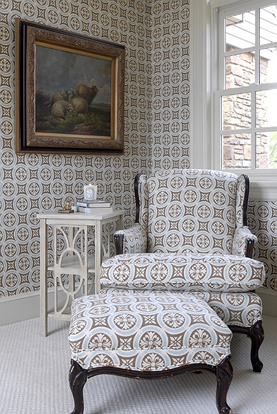
I've always been wary of matching upholstery to curtains (or to wallpaper). For one, the practice strikes me as dated, having generally gone out of vogue around the time the first George Bush left office. But, as with fashion, what goes around invariably comes back around in the world of interiors -- and, as we all know the 1980s are back. And so, I'm starting to rethink my traditional bias. In the right hands (and with the right pattern), matching patterns on walls, windows, and/or furniture can make a bold, confident statement.
To quote Jonathan Adler in "My Prescription for Anti-Depressive Living" (the most enjoyable "design" book ever): "Take your bedding to the limit. Luxuriate in matching linens, drapes, headboards, and pantsuits." Pantsuits aside, I'm fairly certain decorator Katie Ridder took JA's message to heart. Why not match your pillow to your walls and then take it up a notch with a matching half-canopy? To paraphrase JA himself, "be a maximalist!" You're preaching to the converted, JA....

Photograph courtesy of Jonathan Adler
Speaking of Adler, j'adore this kitchen he designed -- especially the way he carried the fabric from the bar stools to the banquet, and even to the light fixtures! Such a great touch; very "happy chic". I also love how the more traditional fabric (in a very mod hue) manages to warm up an otherwise very modern kitchen. Indeed, Jonathan Adler, who might as well be a direct descendant of David Hicks, is a mater at matching (and at mixing for that matter...but that's another post). Moreover, his matching manages to come off as more modern than traditional, primarily as a result of his fabric choices, which tend to be rainbow-brights that are more graphic than fussy.
 photograph courtesy of Phoebe Howard
Like monogramming any spare pillow, I've always thought that repeating the same fabric throughout a room was a very Southern way to design a space. If you've ever spent much time touring old plantation homes around Charleston or Savannah, you know what I mean. Atlanta-based decorator Phoebe Howard probably best exemplifies this aspect of "Southern Style"; in fact, if Adler is the King of Matching, I'd have to anoint Phoebe is queen. Because I can't get enough of PH right now, here are two more examples of her work:

I think the key to Phoebe's success is keeping the color palettes minimal -- the matching patterns are the stars here, not the array of color. Additionally, her rooms each include a secondary fabric (either a strong solid or a larger print) that coordinates with the primary fabric, but does not "go" perfectly, thus adding an unexpected element of liveliness to an otherwise subdued (and what would otherwise be overtly coordinated) space. Also note how by matching her curtains to her wallpaper in the last picture, Phoebe reduces the contrast level and manages to create the illusion of the walls flowing seamlessly into the windows.
As with any bold statement (be it in fashion or interior decorating), it can be difficult to walk the line between edgy or avaunt guard and just plan ugly. Sometimes it's simply a matter of just too much of a good thing, and sometimes the entire idea was a bad one from the beginning. Domino -- may it rest in peace -- certainly featured it's fair share of rooms illustrating the disastrous effects of matching patterns. Perhaps they intended it as a word of warning?
domino, February 2008

domino, April 2008
Normally, I think Peter Dunham (who designed the room pictured above) is a great designer and I covet many of his rooms, but this is just way, way, way too much toile and the overall effect is far too fussy with the skirted chair, feathered (!) lamp, and intricate bamboo daybed. Perhaps if the style of the furniture was cleaner, this would work better. ...Or maybe I just really don't like that much toile. [By the way, the fabric was supposedly initially designed for Jennifer Garner...I would've guessed someone more like Shirley MacLaine.]
 domino, February 2008
I wouldn't suggest looking at this one too closely, you may get a headache. Perhaps the genius in this space is that the pattern manages to be so loud, so insane that you don't immediately notice the fact that there's a skinned lizard (or is it a gator?) on the wall, a zebra pelt on the floor, and large Christmas-tree ornaments in front of the fire place.
So what are your thoughts on these spaces? Can matching ever work? If so, have you tried it at home?


4 comments:
So, you're thinking about my master bedroom with the drapes that match the master bath wallpaper? Originally, the bedspread was the same fabric, too!
I guess I'm a true southerner, I love Phoebe Howard's rooms!
My bedroom is mixed black and white patterns. Black sheets on the bed with a couple of different duvet covers in different b/w floral patterns depending on the weight of blanket I need.
The furniture is solid black IKEA peices,solid black curtains. I have a nice shelf with storage photo boxes in different patterns, but all are black and white. Nothing matches, yet everything does. For my pops of color I have a vase of very nice delicate silk flowers in bright orange on the dressser, and a series of smaller 3x3x3 boxes in b/w patterns with brightly colored lids, these hold the smaller items like earrings and look neat and tidy.
Theres not alot of furniture in my bedroom, just a white vanity, the bed, the dresser, a book shelf. I plan to later add a white w/ black floral patterned chaise from IKEA.
I love that the boxes and the bedding have some pattern crossovers without being too matchy matchy. It Looks amazing with plain walls with a few prints hanging.
The dining room and kitchen also match. I have one of my white walls accented with green and teal circles, all the cookwear is le cruset in teal, and a mix of lime green and teal everything else, lots of stainlesss steel as well.
The rooms are open to each other so the colors match but the style is simple. I plan to redo my dinning set with new fabric. I'm looking for teal and green fabric in a stripped pattern to offset the circles pattern on the wall. But not in a gaudy way.
I try to keep everything from being too busy. Because no matter what patterns you like, it's easy to destroy a room over decorating it.
WLM: I agree with you -- over decorating is the quickest way to make it feel stuffy and unlivable. I love the idea of using teal & lime as accent colors; very lively!
Post a Comment