Tuesday, March 10, 2009
My Chair is Famous!
Read more...
Red, White and Turquoise
designed by Jeffrey Bilhuber
Outfitting a room in complimentary colors (which are two hues that are opposite each other on the color wheel), like red and green, has long been a designer's trick to achieving pleasing visual contrast in a space; however, these complimentary pairings (blue/orange, yellow/purple, red/green) can often read as very traditional. To get a more modern feel, try adjusting one or other of the hues slightly (e.g., green to turquoise or blue). Right now, I can't get enough of spaces with red and blue accents -- especially when the blue is cool robin's egg blue or a vibrant turquoise.
domino, May 2008
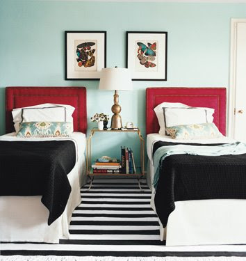
domino, June/July 2008
I love both of these guest/kids' rooms from domino. While the first is decidedly more traditional, the red chandelier and red picture frames keep it lighthearted. In the second, I love the graphic contrast of the black and white rug with the solid walls and bed linens. Such a great statement. And the best part is those red bed frames were from Target (and still available on their website here)! Now if only another American shelter magazine could integrate such budget-friendly items into its spaces....
designed by Tobi Fairley
The rug in Tobi's space is very Jonathan Adler to me, and I think it's such an interesting contrast to the very traditional furnishings and fabric. The differing scale of the patterns keep it from being overwhelming, though it's admittedly a busier look than a lot of people like.
This space is actually from Serena and Lily's catalogue and I love how the red/blue color scheme is tweaked to hot pink/robin's egg blue to suit a little girl's room. It's fresh and young, but still sophisticated, especially when paired with the white built-ins and Jonathan Adler ceramics.
designed by Katie Ridder
I know I posted this picture only a few days ago, but I couldn't resist including it in this post again. I'm just completely in love with this space.
LivingEtc, March 2009
Leave it to British mag LivingEtc to really turn it up a notch. Everything in this room, from the colors to the butterflies to the wallpaper is just completely on-trend.
.jpg)
And last but not least, a few of my favorite red and/or turquoise items, perfect for a pop of color just in time for spring:
Read more...
Monday, March 9, 2009
Good Design for Less: Lit 101 Pillow

Read more...
Pause for Real Life

That's not to say Dave and I have been untouched by the crisis in our day-to-day lives. Dave works for a large oil field services company (we'll call it OFS, for short) that has gone through not one but two major layoffs since last summer. Fortunately for us, Dave has been spared thus far. But even small changes have been noticed around the office. OFS has slashed budgets across the board, bonuses, and even suspended the plant watering services and the office candy jars -- the latter much to Dave's chagrin. Back in the 1980s, OFS even resorted to suspending janitorial services (gross). Given Dave's employment at OFS, we, like much of Houston, are in the rather unique position of wanting oil and natural gas prices to rebound.
As for me, Energy Company continues to struggle (the economic losses we suffered due to Hurricane Ike and some other power industry-related issues were staggering) and the tight credit markets have only exacerbated the situation. Last week, Energy Company announced a sale of half of its business to a competitor, and I will be leaving (along with about 1300 other employees) to go work for this competitor. All in all, the sale was a good thing, not just for Energy Company, but for the transferred employees. We're all keeping our jobs, and in a major equity sale, that's highly unusual. I will say, for the record, that I have been incredibly impressed by Energy Company's treatment of its employees every step of the way. Employees were guaranteed at least 50% of their target 2008 annual bonuses and received nominal salary increases this year while officers and SVPs received their actual earned bonuses and no pay bumps. All these moves may not have made shareholders happy (Energy Company's stock has lost 95% of its value since its high in July 2008), but its kept its employees loyal, something I think is far more important in the long run.
If you feel like sharing, let me know how things have been for you. We're in this together, after all, and the bad times are always easier when the burden is shared (and we allow ourselves at least a little opportunity to bitch).
Read more...
Friday, March 6, 2009
Get Behind Me Nordstrom!


Read more...
Thursday, March 5, 2009
Somebody Stop Gareth Pugh
I blogged about designer Gareth Pugh's Fall 2009 menswear collection before, and I think my general reaction to his RTW collection (which debuted yesterday in Paris) is the same. I recognize this is more art than fashion, but art should be beautiful or important. This, IMHO, is neither. Besides, this collection is supposed to be ready to wear. My question to Mr. Pugh is, where would I wear these exactly? Beyond the undead make-up and Derelicte-meets-Matrix styling, these outfits are just completely unflattering. Who wants to look like a shapeless blob?
Read more...
Outside Over There

I find this photograph by Sarah Diaz (available for purchase at UGallery) completely mesmerizing. It reminds me so much of one of my favorite children's books, Outside Over There by Maurice Sendek. In the book, a little girl named Ida flies through the air in her mother's yellow raincoat in search of her baby sister who was stolen by goblins. Does anyone else remember this book?

...There are days -- like today -- that I want the sense of security that comes from being completely enveloped in your mother's coat. All wrapped up in it, you can go out and face the world head on, knowing its magical power will keep you safe from harm.
Read more...