Saturday, February 28, 2009

Flattering Stripes

As someone who is larger on top than bottom, I normally avoid prints or patterns (especially stripes!) on top. After all, who wants a print stretched awkwardly across one's chest? Suddenly, those straight lines appear unattractively wavy. But, perhaps against my better judgment, I just can't get enough of stripes for spring right now. Any way you do them -- nautical, menswear, or Gallic -- I love the easiness and androgyny of stripes for spring. And, when done right, they can be (I promise) incredibly flattering.

1. Fine Stripe Henley ($88, Boden). Love the big graphic white buttons paired with the white sunglasses.

2. Bow-tie Striped Blouse ($49, Banana Republic). The menswear-style vertical stripes are ultra-flattering, especially when softened with the bow.

3. Tricolor Cardigan ($139, Shopbop). A super-fine cardigan is perfect for Houston weather and the button-detailing at the 3/4 sleeve makes this one just a little special.

4. Harbor-stripe Bikini ($54/top, $42/bottoms, J.Crew). About the most flattering striped bathing suit you could find. I also like how the bottoms aren't too bare.

5. Juicy Couture Striped Dolman Top ($128, Shopbop). The banded waist and easy fit make this perfect for weekends. Diagonal stripes ensure it's flattering.

6. Pamela Stripe by Andre Assous ($110, Piperlime). Striped espadrilles are a great way to sport horizontal stripes without fear they'll make you look wider.

7. Michael by Michael Kors Cardigan, Tee & Linen Pants ($69.50-$129.50, Nordstrom). Love MK's slouchy, decidedly French take on the nautical look.

8. Yarn-dyed Striped Scarf ($58, J.Crew). An oversized, whisper thin scarf that's great for transitional weather.

9. BCBG Striped Crepe Dress ($258, Bloomingdale's). This is such a great example of how a dress can be sophisticated and sexy without being overtly revealing. Besides, stripes are such much more unexpected than the LBD.


Read more...

Thursday, February 26, 2009

Do you match?

photograph courtesy of Tobi Fairley

I've always been wary of matching upholstery to curtains (or to wallpaper). For one, the practice strikes me as dated, having generally gone out of vogue around the time the first George Bush left office. But, as with fashion, what goes around invariably comes back around in the world of interiors -- and, as we all know the 1980s are back. And so, I'm starting to rethink my traditional bias. In the right hands (and with the right pattern), matching patterns on walls, windows, and/or furniture can make a bold, confident statement.

The look is undeniably "decorated" -- more in the vein of David Hicks or Dorothy Draper than most modern decorators -- but why are so many of us painstakingly decorating our spaces to achieve an "undecorated" look? It's not unlike the "no makeup-makeup look" or spending gobs of money on clothes that make you look like you just rolled out of bed. Why not buck the trend to look "undone"? Why not match? Of course, matching can be just as hard as mixing, but I've pulled together a few photos from some of my favorite interior designers to inspire you.

photograph courtesy of Katie Ridder

To quote Jonathan Adler in "My Prescription for Anti-Depressive Living" (the most enjoyable "design" book ever): "Take your bedding to the limit. Luxuriate in matching linens, drapes, headboards, and pantsuits." Pantsuits aside, I'm fairly certain decorator Katie Ridder took JA's message to heart. Why not match your pillow to your walls and then take it up a notch with a matching half-canopy? To paraphrase JA himself, "be a maximalist!" You're preaching to the converted, JA....

Photograph courtesy of Jonathan Adler

Speaking of Adler, j'adore this kitchen he designed -- especially the way he carried the fabric from the bar stools to the banquet, and even to the light fixtures! Such a great touch; very "happy chic". I also love how the more traditional fabric (in a very mod hue) manages to warm up an otherwise very modern kitchen. Indeed, Jonathan Adler, who might as well be a direct descendant of David Hicks, is a mater at matching (and at mixing for that matter...but that's another post). Moreover, his matching manages to come off as more modern than traditional, primarily as a result of his fabric choices, which tend to be rainbow-brights that are more graphic than fussy.

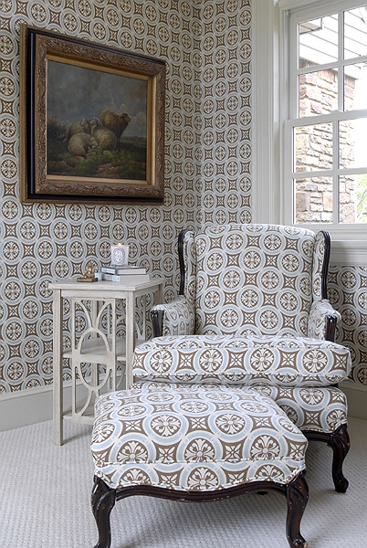
photograph courtesy of Phoebe Howard

Like monogramming any spare pillow, I've always thought that repeating the same fabric throughout a room was a very Southern way to design a space. If you've ever spent much time touring old plantation homes around Charleston or Savannah, you know what I mean. Atlanta-based decorator Phoebe Howard probably best exemplifies this aspect of "Southern Style"; in fact, if Adler is the King of Matching, I'd have to anoint Phoebe is queen. Because I can't get enough of PH right now, here are two more examples of her work:

I think the key to Phoebe's success is keeping the color palettes minimal -- the matching patterns are the stars here, not the array of color. Additionally, her rooms each include a secondary fabric (either a strong solid or a larger print) that coordinates with the primary fabric, but does not "go" perfectly, thus adding an unexpected element of liveliness to an otherwise subdued (and what would otherwise be overtly coordinated) space. Also note how by matching her curtains to her wallpaper in the last picture, Phoebe reduces the contrast level and manages to create the illusion of the walls flowing seamlessly into the windows.

As with any bold statement (be it in fashion or interior decorating), it can be difficult to walk the line between edgy or avaunt guard and just plan ugly. Sometimes it's simply a matter of just too much of a good thing, and sometimes the entire idea was a bad one from the beginning. Domino -- may it rest in peace -- certainly featured it's fair share of rooms illustrating the disastrous effects of matching patterns. Perhaps they intended it as a word of warning?


domino, February 2008

Quite honestly, this room is probably my least favorite room ever to appear in domino's four years of existence. It's the fashion equivalent of pairing a leopard-print dress with leopard-print pumps and a striped handbag: sure, the striped handbag is different, but it doesn't really balance the effects of the leopard-print dress and shoes. To avoid having your room look like Lisa Rinna lives in it, I'd suggest keeping the animal print as an accent pattern: a zebra pillow or a cozy cheetah-print throw. More than that and your room will either start to look like a safari...or a brothel -- two looks best avoided.

domino, April 2008

Normally, I think Peter Dunham (who designed the room pictured above) is a great designer and I covet many of his rooms, but this is just way, way, way too much toile and the overall effect is far too fussy with the skirted chair, feathered (!) lamp, and intricate bamboo daybed. Perhaps if the style of the furniture was cleaner, this would work better. ...Or maybe I just really don't like that much toile. [By the way, the fabric was supposedly initially designed for Jennifer Garner...I would've guessed someone more like Shirley MacLaine.]

domino, February 2008

I wouldn't suggest looking at this one too closely, you may get a headache. Perhaps the genius in this space is that the pattern manages to be so loud, so insane that you don't immediately notice the fact that there's a skinned lizard (or is it a gator?) on the wall, a zebra pelt on the floor, and large Christmas-tree ornaments in front of the fire place.

So what are your thoughts on these spaces? Can matching ever work? If so, have you tried it at home?


Read more...

Wednesday, February 25, 2009

Huaraches para Primavera

While I love all things Greco-Roman, I'm not entirely sure I can get behind the gladiator trend that's been popping up all over the place for Spring. Besides, the majority of these so-called gladiator sandals strike me as more dominatrix than Roman anyway (see Exhibit A). Instead, I think I'll head south of the border for inspiration and try some huaraches.

Huaraches (traditional Mexican sandals easily recognizable by their woven leather tops) are a big trend for spring, too -- and a much easier one to pull off. Whether you prefer a more or less literal interpretation of the trend, I've rounded up a half dozen of my favorite huarache-inspired sandals. I'm particularly attracted to each of these right now because they're so much less bare than the thong sandals or flip flops that have been dominating warm-weather shoes for years now. As a result, I think they're a sandal that could work at the office (where you should NEVER be showing up in flip flops), thereby making it easier for me to justify purchasing a pair.

1. Anya Sandal, Tory Burch ($250; also available in silver or brown). Ack!! I am so, so tempted by these....argh. Moreover, Mrs. B. appears to be leading the huarache-charge this spring; she also has a huarache-style wedge (available in black) and huarache-style high heel (in tan). In short: whatever your heel preference, Tory has you covered.

2. Paristu Sandal, Corso Como ($154.95; also available in black or tan). My favorite of the wedge options. I love that the wedge isn't ridiculously tall (I tend to feel like I'm clopping around on stilts when they're too high) and that the platform is wrapped in suede, which is a nicely luxe detail.

3. Ferran, Sam Edleman ($135; also available in navy). When I first saw these, I thought their name was "Farrah" (as in Fawcett) rather than "Ferran" -- which would work well, I think, since these shoes have a definite 70s/early 80s quality. Plus, their reasonable heel height (2.75"!) means you could walk around in them all day. Definitely a great option that works well in the office and on weekends.

4. Belle by Sigerson Morrison ($265). Obviously, these are a more subtle homage to their Mexican forefathers, but I love the yellow suede and the nice woven detail around the toes -- they'd be a great pick-me-up for basic jeans and tees. Yes, they're a bit pricey, but I think (if you pretreat the suede) you could have these for years and lately I find myself preferring to buy less, but buy (a) what I love and (b) what can last.

5. Huarache Air Sling, Cole Haan ($301.95, also available in black, silver and off white). Again, this one is a much less literal take on the trend, but I had to include a pair of Cole Haans since his "air" series are (IMHO) the most comfortable heels on the market today. Besides, who can resist the orange! Like Tory Burch, Cole Haan also offers huarache styles in super-cute wedges ($201.95) and practical (and, to be honest, slightly dowdy) flats ($171.95), as well as in an array of colors (go for the fuchsia!).

6. Damsel Sandal, DV by Dolce Vita ($69.95, also available in black and silver). These were my favorite well under $100 option and I think Dolce Vita shoes are a great bargain and very well made. These are also the most casual option, and I think they'd be really cute with shorts or a sundress.


Read more...

House Beautiful / Beautiful Color

Since the demise of domino I've been looking for a replacement among the many remaining shelter magazines on the newsstands. After all, I don't want to commit to another magazine subscription unless I'm sure I'll like it. And so far, I'd say the next best thing to domino (that's readily available in the U.S. anyway) is House Beautiful. The March issue, currently out on newsstands, has an amazing spread on color and is definitely worth giving a shot before you write the magazine off as stuffy or unattainable. Besides, that blue kitchen featured above is the second blue kitchen that I've seen this month that I've liked (and is seriously making me rethink my prejudices against painting cabinetry anything but white).

This first image is the bedroom from a home in Montecito, CA, designed by Christina Rottman (which incidentally also features the amazing blue kitchen on House Beautiful's cover). While I question whether or not you can maintain that beige constitutes a color for purposes of a color issue, I absolutely love this room. The dark beams, the gorgeous wallpaper, the barely-there iron four poster bed...simply stunning.


The two images shown above are both taken from the home of antique dealer Ned Marshall in New Orleans, LA, and I think they demonstrate Marshall's mastery of color. Both rooms use rich, saturated tones but avoid feeling oppressive or chaotic because of the rooms' high ceilings, bare floors, and pared down palette. In the entryway, Marshall makes his major statement with the pink couch while the walls and accessories take a supporting role. In the sitting room, the walls are allowed to shine in Hermes' orange, while the furniture and accessories are either neutral or match the walls' hue.

The final house spotlighted in the color feature is the Pennsylvania farmhouse designed by Jeffrey Bilhuber (whose client list includes Anna Wintour, David Bowie, and Peter Jennings -- seriously!). The color palette here is the most intense and incredibly unique. Who would've guessed that kumquat, indigo and eggplant would work so well together? From the painted floors to the bright upholstery, I love it all.

For more pictures and the (for once) really information interviews from all the designers featured in the color issue, pick up a copy of House Beautiful -- and be sure to come back and let me know what you think of the feature, as well as where you fall on the color spectrum (Based on their methodology, I suppose I'm either "deep" or "intense".)


Read more...

Tuesday, February 24, 2009

Calvin Klein Home -- On Sale at Macy's

I've been lusting after the new Calvin Klein furniture collection since it was spotlighted in Elle Decor last fall. In keeping with the rest of CK's home collection, these pieces manage to walk the line effortlessly between modern and timeless. Yes, they're minimal (but what else would you expect from CK?), but the mix up of wood, stone, metal and linen give each piece some great texture and a warm and organic quality that's often missing (for me at least) in modern design.

What's great about the entire collection is that these pieces could be made to work with just about any decor and aren't just for the modern and minimalistic aesthete. For example, some new upholstery could definitely turn up the volume in order to work with a more eclectic space. The chocolate linen the Destination Arc accent chair comes upholstered in blends in too much with the fantastic teak arcs for my taste. While you could certainly recover the chair in a contrasting solid fabric (think off-white, grey or even orange) to highlight the architecture of the chair, accent chairs really are the perfect place for a print -- and I think this chair would be absolutely stunning recovered in some of Kelly Wearstler's Imperial Trellis II (in java/cream). I would also recover the City Couch -- in my fantasy world, anyway -- in Kelly's Manor Gate (in charcoal); after all, cotton linen is pretty basic and the simple lines of the sofa could easily stand up to a graphic pattern. Another great (and much less expensive) option for the sofa would be Mod Green Pod's Aspire fabric.

The great news is that the entire furniture collection, which is available only at Macy's for the time being, is now substantially discounted -- as in 30-60% off! I'm a little surprised at the major discounting (economy notwithstanding) since the collection only debuted at the beginning of this year, and I hope it isn't a sign that the collection is to be discontinued so soon after its launch. Now if only I had some room in my house for one (or more) of these pieces....


Read more...

The Best Coat of the Season?

If I could only buy one spring coat for the rest of my life, I would pick this ruffle trim nylon trench by Dolce&Gabbana: it's classic, versatile, beautifully constructed, and with just the right amount of detailing to make it special. Unfortunately at $2,595, it would have to last the rest of my life, but I would be an oh so stylin' old lady.

Read more...

Monday, February 23, 2009

21c in Louisville

Cracking Art, Red Penguin (2005)

This weekend a friend and I went to Louisville, Kentucky, to visit a mutual friend of ours from high school. I'd never been to Louisville before (or Kentucky for that matter) and, to be quite honest, didn't have the best impression of the city going into the weekend. But perhaps the one thing that I love the most is dispelling my preconceived notions (which are probably sometimes more appropriately classified as prejudices) about a place.

If you had asked me prior to my visit what I thought of when I thought of Kentucky, I would've rattled off the Kentucky Derby, bourbon, KFC and -- I'll admit it -- rednecks. And sure, all those elements (yes, even rednecks) exist in the state, but there's a lot more there than I'm sure most of us outsiders give it credit for. Louisville struck me as a smaller version of Austin with its thriving art scene and abundance of college students. And (unlike Austin), Louisville has some amazing historic architecture with neighborhood after neighborhood of beautiful Victorian homes.

But, if I had to select my favorite thing about Louisville -- its "best of the best", so to speak -- I think would have to say it's 21c, a hotel/restaurant/modern art museum.

Abbas Kiarostami, Sleepers (2001)

Per 21c's website, 21c Museum Hotel is "the first of its kind-a 90-room hotel dedicated to world class luxuries, Southern-style hospitality and contemporary art from living artists". Featuring a 9,000 square foot contemporary art museum funded and managed by the International Contemporary Art Foundation in the hotel's lobby, 21c is a "can't miss" for any art lover. The hotel features a permanent collection which includes the Red Penguins that are featured (and constantly rotated) throughout the hotel, Sleepers, a DVD projection on the floor right in front of the reception desk, and -- my personal favorite -- Text Rain, an interactive video projection by the elevators.

Camille Utterback & Romy Achituv, Text Rain (1999)

While Lauren and I stayed at Kristin's house during our visit to Louisville, I certainly wouldn't mind spending the night at 21c. The guest rooms look just as modern and fun as the lobby. I also love how bright these rooms are, it's such a refreshing change from the dark, dark interiors found in many boutique hotels.


After perusing the lobby, we sat down to a wonderful dinner at 21c's restaurant Proof on Main. The modern art theme continues from the lobby into the restaurant and bar, where permanent installations and rotating exhibits by contemporary artists' works are featured prominently throughout around the restaurant. Some of my personal favorites:

Vee Speers, Untitled #16 (from Birthday Party series) (2007)

Bae Bien-U, Sonamu SNM1A-014V (2002)

Larry Shank, Randy, 2005

Johnson Foster, Zebra Trophy (2005)

We ended up eating dinner at a table right under the woven leather zebra pictured above. The menu is predominately Italian, but with a hearty sprinkling of Southern foods (think grits) thrown in for good measure. For dinner I had the yellow fin tuna crudo, a half order of the butternut risotto (which was absolutely delicious!) and we all split the vanilla pudding cake topped with bourbon-soaked cherries (again, amazing). The restaurant also has a great assortment of unique cocktails. But best of all? Because it's located in Kentucky and not New York, Proof is extremely well priced: my share of a three-course meal, a bottle of wine, and round of cocktails came out to only around $55.

After having such a great experience at 21c in Louisville, I was very excited to discover that 21c will be opening up a second 21c in downtown Austin, Texas, which will also feature residential units in addition to the hotel and museum. I think 21c will be a perfect addition to Austin's very hip art scene and can't wait to spend a long weekend there once the project is completed in 2011.

Read more...

Friday, February 20, 2009

Budget Fixes for Ugly Bathrooms

One of my favorite features on mega-blog Apartment Therapy is its House Tours, which showcase the homes of its readers. I like these tours because they're usually of homes you don't see in design magazines. The often space-challenged homes are rarely decorated by professionals and, more often than not, are reflective of their owners' (or renters') limited budgets. Rather than inhibiting the owners' creativity, I've often found these constraints can result in some seriously impressive problem solving.

This week I was particularly impressed by Nicole and Colin's "streamlined salvage" DC home. Bizarre (and kind of annoyingly alliterative) dubbing of their style aside, I loved the couple's solution to a common problem many homeowners face: ugly bath tile. Unable to undertake a massive bathroom renovation, Nicole and Colin found a shower curtain that included a similar tone to their pinky-yellow tile and allowed them to bring a second color (the grey-blue paint) into the space to help tone down the tile. The result is both retro and pretty. In fact, I almost like the tile.

If you're facing a similar problem of your own, the homeowners' shower curtain (the Dobby-stripe shower curtain from Restoration Hardware) is available in a variety of colorways and, like any patterned fabric, is a great jumping off point for a room design -- just stay within the fabric's color palette and you'll be set! Random aside: I actually have the same curtain in Ash hanging in my upstairs bathroom and I love it.

Seeing Nicole and Colin's house got me thinking, what else can you do (on a budget) to spruce up an outdated, ugly bathroom without actually having to resort to pulling up tile and starting over?

Distract yourself with color: As with Nicole and Colin's bathroom, the right paint color can rescue even the saddest bathroom tiles. And, since the amount of wall space in most bathrooms is tiny, you won't even need much paint to completely transform the space. The oatmeal-colored tiles in the bathroom pictured above could easily read as dingy or just plain boring (they don't even have that fresh and clean feeling that white tiles would have) when paired with the wrong paint color. Max Chamberlain's (AT's resident color expert) decision to paint the walls coral manages to make the tile choice deliberate rather than simply what the homeowners inherited.

Cover 'em up: So far, my suggestions have focused on keeping the existing tile as-is and trying to make it work with color and fabric. But what if your tile really is that hideous? Since replacing the tile would be out of our imaginary budget and painting tile can have some seriously nasty effects, why not just cover it up? Available from 2Jane, Mibo's "tile tattoos" are an inexpensive and impermanent (perfect for the renter!) way to disguise ugly or or even just jazz up boring tile. The "tile tattoos" are really just opaque stickers, cut to fit standard 4" or 6"-square tiles or even standard subway tiles. Prices range for $16/set of 6 to $18/set of 6. Their options range from retro to Scandinavian to Tuscan and I think most of them are adorable.

Go for the grout: While you may not be changing out the tile in your bathroom, you may want to consider the grout. Dirty, greasy grout can make even nice looking tile less appealing. With a little bleach and elbow grease, you can get most grout looking almost like new. Doityourself has a very thorough post on cleaning grout yourself here. If you've scrubbed and scrubbed and your grout still looks like Hades (or if you've inherited the ill-advised predilection for light tile and dark grout of a prior owner's), you can always try your hand at restaining the grout to the color of your choice.

Don't forget the finishing touches: As in the rest of your house, sometimes it's the little details that can make a bathroom go from bleh to great. A word of advice though: avoid any sort of themes. Having a shell-shaped soap dish won't make you feel like you're in Tahiti any more than a zebra bath mat will make you feel like you're on safari. If you can stand to wade through all the "Bear necessities" and "Jumpin' Dolphins" bath collections, Target has some nice budget-friendly options (like Isaac Mizrahi's collection, pictured above, which looks very Jonathan Adler to me -- speaking of, his druggest bath accessories are to die for, but less budget-friendly).

Of course, bathroom accessories don't have to be made specifically for the bathroom. I love the idea of keeping cotton balls, q-tips or hair ties in one of these beautiful oak lidded cups by the British company (with Swedish roots) ISAK. And of course, I love the idea of a coordinating birch wood tray to corral all the cups (I'm pretty anal like that).

If you're budget allows for it, I really adore almost everything India Rose does for the bath. Her amara bathmat ($58), argyle shower curtain ($100), and pintuck shower curtain ($110) are all pictured above.

Does anyone else have any other suggestions for how to fix up an ugly or outdated bathroom without major renovations? If so, please share the wealth and leave your words of wisdom in a comment below.


Read more...

Cibus Corner: All About Baking

As promised, this week's Cibus Corner is focused on my favorite meal: dessert. Jane, the keyboard is yours!
Chef Babs, aged 2

Like many cooks, my favorite thing to make is desserts. I am not sure why, as I refuse to keep them around my own apartment, but I love to see people’s faces light up as they dig into a fresh pie or a warm piece of chocolate cake. I just love how homemade desserts can perk up a slow evening or a long, hard day at work. I also find baking very relaxing, which may be why I had the Nestle Tollhouse Chocolate Chip Cookie recipe memorized at 16...seriously. For me, baking is therapeutic, and I enjoy how it makes an evening at home a bit more special. I also love how over time a family recipe becomes comforting and a tradition in itself. The following are my favorite desserts that are always welcome, no matter what the occasion.

Italian Cream Cake

This first recipe has been in my family for many years now and again, comes courtesy of Aunt Joe Ann. My aunt thinks that she cut it out of the Houston Chronicle sometime in the 1970s. This is bar-none the best Italian Cream Cake recipe ever. My aunt and I even made it as the groom’s cake for my friend’s wedding. The only thing tricky about it is the fluffing of the egg whites (it helps to have a cold metal bowl). Other than that, the recipe is fairly fool-proof.

Ingredients:
1 tsp. baking soda 5 eggs, separated
1 cup buttermilk 2 cups flour, sifted
1/2 cup butter 1 tsp. vanilla
1/2 cup shortening 1 cup pecans, chopped
2 cups sugar 1 can flaked coconut (3.5oz)

Preheat oven to 325F. Combine baking soda and buttermilk. Let stand for a few minutes. Cream butter and shortening with sugar. Add egg yolks one at a time, beating well after each addition. Add buttermilk alternately with flour to creamed mixture. Stir in vanilla. Beat egg whites until stiff; fold in egg whites. Gently fold in pecans and coconut. Divide cake mixture between 3 (9-inch) greased, floured cake pans. Bake for 25 minutes or until cake tests done.

For the frosting:

1 (8 oz.) package cream cheese
1/2 cup butter
1 tsp. vanilla
1 box powdered sugar
1 cup pecans, chopped

Mix cream cheese and butter (both at room temperature) until creamed; add vanilla. Beat in sugar a little at a time until frosting is at the desired consistency (spreadable but not stiff). Frost completely cooled cake and sprinkle with chopped pecans.

Here are some tips that Joe Ann doesn't clue you in on to make the cake go from great to extraordinary: double the icing, toast your pecans in the oven, and substitute cake flour for regular flour. If you do those things and otherwise follow the recipe to the letter, your guests will definitely be blown away. Since it's a three-layer cake, I suggest reserving this dessert for larger gatherings.


Nigella's Triple Chocolate Brownies

The next recipe comes from our favorite British cook and glamazon, Nigella Lawson. Her brownies are so good that they're worth the gazillion calories that they contain. If you are a chocolate lover, then these brownies will definitely satisfy your cravings! My sister -- yes, the mistress of this blog -- once doubled the butter (they already start with over three sticks!) and we all still gobbled them down; however, I don’t recommend trying this yourself...the side effects were not desirable. These brownies are great for children. They are also perfect for wedding and baby showers, as well as a night in. I would suggest pairing them with a light meal because these will truly be the bulk of your dinner! To enjoy, just click here for the recipe.

Next Week: Wedding and Baby Shower finger-foods

Read more...

Thursday, February 19, 2009

Guest Post @ We Love Domino

domino, August 2007

Like many of you, I continue to mourn the loss of domino magazine. When I received what was to be its last issue, I couldn't quite decide how, when and where I should read it. The last one should be savored, yes? Not just flipped through while I'm watching trashy TV on my sofa...

The moment domino shuttered its doors, the "Keep domino alive" campaigns began to spring up. One of my favorite iterations of this movement is the new blog We Love domino!, which features regular guest posts from various design bloggers showcasing the very best of domino. With so much involvment from the blogging community as a whole, Kate's labor of love promises to be a great online forum where domino fans can continue to find inspiration from their favorite shelter magazine.

domino, May 2007

This week, I had the opportunity to do my own ode to domino, which features the magazine's best gardens and outdoor spaces. Be sure to check it out here and let me know what you think.


Read more...

Wednesday, February 18, 2009

R.O.Y.G.B.I.V.

I know this may be unpopular right now given the current trends, but I am kind of sick of white, bleached out interiors. While a room awash in neutrals can definitely be serene and even sophisticated, when put in the wrong hands, it can end up feeling (a) institutional and cold or (b) like you took your realtor's advice and removed all the personality from your house because you're trying to sell it.

On the other hand, a room inspired by one (or more) colors of the rainbow is so much more fun. And of course the best thing about using bright, bold colors is that it works for any style and any space: just choose your favorite color (or two, or three) and go crazy.


The key to the success of all of these spaces is balance -- the Golden Rule of decorating. When you go big and bold on the walls, the room works best when furniture is more sedate. The drama in the room comes from the wall color itself and depending on the color choice, that can be more than enough. In contrast, when the furnishings are the stars, the walls should be kept neutral, allowing the chair, sofa or accessories to take their proper place at center stage. J.Crew creative director Jenna Lyons' formal living room (below left) is a spectacular example of how even a small dose of color (here, the yellow sofa) can manage to make an otherwise neutral space extremely vibrant and -- in part because the contrast between the yellow and the gray is so high -- very modern. On the other hand, you can achieve a more traditional look by keeping the contrast between walls and furniture lower (see below right).

Another general rule of using color is that, the more varied your color palette, the more eclectic the overall effect. Pulling in every color of the rainbow creates a high level of contrast and mismatch, which can work if you're going for a bohemian look. Somewhat counter intuitively, a rainbow of accessories can -- when used in an all-white interior -- have a very fresh European look, as shown in textile designer Chrissie Probert Jones' entryway (shown at the beginning of this post). But generally speaking, if you're going for modern and/or minimalist, it's best to keep it to one (at most two) bold accent color(s), like Lee Kleinhelter's yellow and white living room or Mary McDonald's green, pink and white living room (each above).

The benefit of working in a single color family is that you can mix up the patterns while still maintaining a "pulled together" look. A great example of this is Annie Selke's blue-green coastal dining room (above right). Despite consisting of a striped rug, oriental wall mural, and Indian-inspired fabric on the chairs, Selke's room manages to be both calm and eclectic without overwhelming the eye. The pattern mixing also works here because the size and proportions of the patterns aren't the same: the mural is large-scale, the fabric medium, and the stripes are small. If all the patterns were either all large-scale or all small-scale, the end result would be too busy and not nearly as successful.

I had to dedicate an entire collage to violet because I adore it in all its many iterations. Like blue/indigo, purples are particularly successful in more traditional interiors, though Sara Story's masterful use of violet on the ceiling of a dining room otherwise done in various shades of gray is fantastically modern and helps focus the eye on the height of the room rather than on its narrow width. If you're looking to avoid an overtly feminine look, try using deep plums and aubergines. These darker iterations can be used for maximum impact and drama, as the first three pictures above illustrate.

Read more...

Knock knock...

I have mixed feelings on vinyl decals. On the one hand, I love how they can add some (temporary) flair to a room without a lot of work. On the other, I think they can easily come off as kind of collegiate -- which there's nothing inherently wrong with, except that I'm well past college (and even graduate school) these days. *

As they say though, you can't really knock it until you've tried it. And so, before tossing the trend into the "not for me" pile, I thought I'd give it a go on my front door:

Kinda snazzy, eh? The decal came from TastySuite, one of many Etsy sellers who specializes in vinyl decals. I liked their offerings in particular because they had designs that weren't too sweet for my taste and/or geared towards children's rooms. The included instructions were thorough and they even sent along a decal to practice on (which now sits on my fridge). All in all, a fun (and temporary) way to add a little spice to my entryway.

What are your thoughts on the vinyl decal trend? Love it? Hate it? Have you tried it?
_____________________
* - If I were still in college, I would definitely have to have TastySuite's jackelope on my wall as it was the official mascot of the political group I was actively involved in. Even now, I'm tempted to get one anyway and put it on my laptop.

Read more...

Tuesday, February 17, 2009

A Tale of Two Chairs

When I worked at the Big Firm, I never would've had the inclination to spend my precious free time (what little I had, anyway) refinishing or recovering old furniture. But, since joining the Energy Company, I find myself with both the time and -- quite unexpectedly -- the desire to do just that. I blame my new found DIY-ness in equal parts on Bravo's Top Design and Design*Sponge's Before & After weekly feature.

Last fall I began stalking Craigslist looking for a cheap chair or two to tackle. I figured if I bought the chair cheaply, I wouldn't be devastated if I ended up completely wrecking it. After a week or so of searching, I stumbled across an ad for two Mid Century Modern chairs ($30 each/$50 for the pair). I figured for that price, I could afford to mess up. Luckily for me, the girl selling the chairs lived only a few blocks away. Two days later, I had my chairs. Of course, it took a while to figure out what precisely to do with these chairs, but once I did, the process for each (although different) was pretty simple.


Chair #1


This first chair was a real find. While I lack the expertise to say for certain, it is at the very least an extremely close replica of the Saarinen Executive Arm Chair with wood legs. Even the original fabric (a tweedy bright blue that had faded to a dull green grossness) looked like the fabric these chairs were originally issued in. What's insane is that the licensed versions of this chair retails on DWR for over $1200 -- and I paid $30! When I saw this chair on Craigslist, I was so excited I was almost frantic, completely afraid the chair would get sold before I could get to it (or that the seller would come to her senses and relist for much, much more). Once I got the chair home, it was evident that the existing fabric was going to have to be replaced -- it was in horrible conditions. Additionally, one of the chair legs had lost part of its veneer and was pretty beat up. And so, in case I was dealing with the "real thing", I decided to let the professionals tackle the job and sent the chair out for a proper reupholstering (though I did attempt to refinish the legs myself first -- directions below). The fabric I used is called "Esha" by interior designer Annie Selke, which is available through CalicoCorners. Esha is also reversible, and I think the reverse of the chocolate/slate would make for a fun (and coordinating) pillow.

The Refinishing Process:

Refinishing is actually a lot like painting and really no more difficult. I first removed the chair legs (which were simply bolted to the bottom of the chair). I then sanded down each leg with medium-grit sandpaper to remove the original finish as well as smooth out all the nicks and dents that are inevitable in a vintage piece. Sanding the legs down by hand is definitely a tedious -- and messy -- process. I would recommend sanding outside and, especially if you're working with a piece that was painted or varnished, wearing a mask. Once the legs were sanded, I cleaned them off with a damp rag (you don't want any grit remaining when you start staining). For stain, I used Minwax in Red Mahogany (to coordinate with my Salvation Army desk), which I picked up at Home Depot. I chose a darker stain than the original finish because the legs were in such bad shape. Minwax Polyshades combine polyurethane and stain in one step, but you could obviously go with just a stain if you don't want the top coat. To stain the legs, I used a small paintbrush. The key to staining is to coat the wood very lightly -- you don't want to just slop the stuff on as you'll be left with inevitable drips and an uneven finish. Minwax recommends doing two separate coats, and using a fine-grade sanding paper in between coats, to get the best finish. I actually ended up just doing one coat and was happy with the result.

I am sure some purists will bemoan my decision to go with a print and not simply match the original fabric, but ultimately I decided to go with what I like. I don't see any real harm in that since the piece can always be recovered later and the original fabric was unsalvageable. Of course, having a piece professionally reupholstered or refinished can be expensive, but in this case, I got the chair so cheaply that even when including the cost of fabric (4 yards) and the cost of reupholstery (almost $200), I am still coming in far below its true value.

For the story of Chair #2, please click on "Read More" below.

CHAIR #2

Since chair #2 was a simpler shape than #1 -- and probably worth a whole lot less -- I decided to tackle the reupholstering myself. First though I sanded and stained the frame (following the general instructions above) with my husband's help over the course of a weekend and probably 3 or 4 hours. The fabric for this chair is called "Pinecone" and I scored it on sale at Pottery Barn. I bought two yards to be safe, but probably could've made do with only 1 yard. Total cost (including stain) came to about $60 for this chair. Chair #2 now sits happily next to the windows in my study, overlooking the backyard.

Reupholstering:

Reupholstering a chair is a lot like gift wrapping -- only with fabric and a staple gun instead of paper and tape. Definitely nothing to be intimidated by. I first unscrewed the seat and backrest from the frame with a screwdriver. I decided to just put the new fabric directly on top of the original but before recovering, I Febreezed the old fabric and let it air out overnight to eliminate any musty odors. If the original fabric is particularly nasty or the stuffing is worn out, you're going to want to remove the original fabric first and/or re-stuff. I find a flat head screw driver is the best tool to remove old staples. Once the old fabric is off, you can fluff up the seat with a new layer of stuffing (available at most craft or sewing stores).

Using the seat cushion as a guide, I cut out the necessary fabric, making sure to allow several inches of overlay on all sides. Using a staple gun, I then began stapling the new fabric to the underside of the seat -- starting in the center point on one side and then the center point on the opposite side ensures a snug fit. Remember to pull the fabric as tautly as possible as you work. From there, continue stapling to the corners, making sure to flip the seat cushion over periodically to check for any folds or creases in the fabric.

For the backrest, I followed a similar pattern but since the underside of the backrest would be visible, I folded over the edge of the fabric before stapling it to create a clean finish. Fortunately the sides of the backrest were going to be hidden by the wooden frame, so I was able to hide most of the staples there. For those few visible staples on the underside, I went back and dabbed a bit of White-out on them to help them blend in with the fabric. If you're working with a darker fabric, a sharpie would do the trick as well.

I am really happy with how both chairs turned out -- they both add a more personal touch to my home. Plus, every time I look at them I feel a sense of pride for finding two ugly chairs most folks would've just dumped and made them work for my home. And of course there's the satisfaction that -- with respect to Chair #1 anyway -- I got a really amazing deal on a piece of design history. If anyone else has some repurposing/reupholstering stories they'd like to share, please let me know. I'd love to hear all about it.


Read more...

Monday, February 16, 2009

Cake Wrecks

Are you familiar with the blog Cake Wrecks? If not, you need to be. My mother (Quotidian Grace) alerted me to the blog some time ago and some of the cakes (all made by so-called professionals) the author manages to find are absolutely hilarious.

Here's a round up of a few of my favorites:

I wonder if the bride and groom who ordered this cake also registered at Orvis and Gander Mountain.

The perfect cake for your nihilist friend's next birthday. I love the ironic tension created by the message and the rainbow as well. I'm not sure I'd describe this cake as a "wreck"; in fact, it might just be the work of a genius.

I'm pretty sure this one speaks for itself, though I think the red flowers are a tad too optimistic for the message this cake is conveying.

Quite possibly the best use of the international "no" sign that I've ever see. Do you suppose Sexual Harassment Panda got to deliver this cake?

Quite possibly my favorite. Is that message supposed to be comforting (as in, "a cold sore isn't so bad, sweetie") or insulting (as in, "get over it and stop your whining you weenie -- it's just a cold sore!")? I also wonder if the person giving the cake is the same person who managed to give the receiver the cold sore. Either way, I'm pretty sure a cold sore never deserves a cake.

This cake decorator got this one wrong on so many levels. I don't even know where to begin: The misspelled words? The inappropriate use of opening quotations? The slavish and literal following of directions? The bizarre "ET" initials in each corner? I just hope the customer got a refund on this one.

Horrific lettering aside, I'm not entirely sure what the quotes on this cake are supposed to imply -- do you not actually read the blog? Is it not really a blog anyway? Confusing...and quite possibly insulting. Either way, please don't send me this.

Be sure to click on over to Cake Wrecks to see more baking disasters (and all the accompanying witty commentary).

Read more...
Related Posts with Thumbnails