

photograph courtesy of Tim Clark
Until tomorrow though, I'll have to be content with dreaming. To fuel my fantasies, I thought I'd post some of my favorite bathrooms designed by some of the best designers in the business. Designers get extra points if the tub is adjacent to a fireplace or overlooks a beautiful view. And, hey, since it's my fantasy, I'll go all the way and request a glorious chandelier in there, too, while we're at it. The bathroom designed by Tim Clark (shown above) would definitely fit the bill.

photographs courtesy of Peter Dunham
Fireplace, gorgeous inlaid tile floors, a gigantic rain shower flooded with light that renders a bathtub completely incidental -- does it get any better than this? I also love the Spanish touches throughout the space, from the windows to the heavy wooden door. In short, if I owned this bathroom, bathing would become a religious experience for me.

photograph courtesy of Mary McDonald
I know this bathroom by Mary McDonald has appeared everywhere from the pages of domino to just about every design blog on the web, but I love how beautifully it merges class design with a fun, zany aesthetic. The monochromatic palette keeps it from veering into busy. The zig zag floor is a great modern counterpoint to the seersucker settee and Classical statuary (a wee bit cheesy, but I'll forgive her). One thing though I'm not sure I can forgive Mary for are the balloon curtains. I'm pretty sure I had the same ones (but in pink, naturally) in my bedroom growing up and it's just too '80s for me.
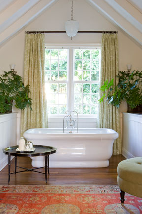
photograph courtesy of Tim Clark
This bathroom is very peaceful in a modern bohemian sort of way. I also love how the tub is centered underneath the large window, which is framed perfectly by the sloped ceilings. The hardwood floors and faded rug give the space a cozy quality. This bathroom (together with the other bathroom designed by Tim Clark shown at the beginning of this post) is also a great illustration of how bringing in "real" furniture (like the ottoman and side table) and accessories not normally used in a bathroom (like the rug and draperies) can really go a long way to sprucing up a bathroom.
photographs courtesy of Traditional Home
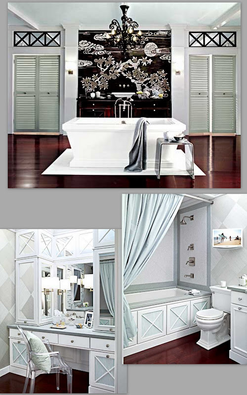
This his-and-her bathroom by Traditional Home's Robert Young for this year's Kitchen/Bath Industry Show is the mother lode of all bathrooms. Murano glass chandeliers, a Michael S. Smith free-standing tub, Chinoiserie-inspired glass mosaic from Ann Sacks, Phillipe Stark's Ghost Chair...in short, it's a design-lover's fantasy. Any one of the three rooms that make up this bathroom is spectacular, but altogether it's just mind blowing. One thing I particularly like about this room is how the "her" tub is a built-in shower/tub combo that is so typical of most homes (despite the growing trend for free-standing tubs). And yet, with the tub surround and tiling, the standard issue shower/tub combo is elevated to something really special.

photograph courtesy of Phoebe Howard
I've sung the praises of designer Phoebe Howard before, but I can't help doing it again -- Oh how I love this bathroom! In some ways, it's fairly standard (white cabinets, Carrera marble counters) but there are so many details (like the floor and mirror!) that make it fabulous. All that beautiful built-in storage would be great, too. I love how Howard tends to build out cabinetry all the way to the ceiling. Not only do you maximize storage space, but the added cabinetry makes the room feel so much taller (and so much more custom). My one reservation about the space is the toilet seat: I just don't get using a dark wood toilet seat. I know it's a bit retro, but I see no reason why you would want to draw extra attention to the porcelain throne.

photograph courtesy of Nathan Egan
The New York-based design firm Nathan Egan Interiors is actually the design duo Wayne Nathan and Carol Egan, and if you aren't familiar with their work, I highly suggest to take a spin through their fantastic portfolio. The team's aesthetic is cutting-edge and modern, but still very livable. Their art choices, like the large-scale art work of a diver in the bathroom above, are also masterful. There's definitely a lot of whimsy in this space, like the ladder leaning to nowhere, and yet it still feels restful and luxurious.
What about you? Where do you escape when you're looking for some quiet time?


